Christmas font. I focused the camera firstly on the tree and then moved the letter stencils I had cut out of card between the camera and the tree. I think the letter type works really well here, it has a Christmassy flavour with the long pointy serif, it has a kind of oldy worlde feel like versal calligraphic lettering and the open D and O are inpspired by Rob Ryan's paper cut lettering.

This is my Queen Bee font the name taken from the uppercase B on the queen card. The inspiration was slightly by accident as I was looking for some card to make templates from. I decided to leave the base of each letter uncut so the letters became 3D.


I think this cub scarf works very effectively as letter forms. Its fluidity enables beautiful unforced shapes to be made. The vibrant clashing colours make the letters stand out The letters together have a cub scout feel as though they are knots or semaphore or 'uses for the cub scout scarf.'

I like the idea of human letter shapes although children are not as malleable as one might think and also bore quickly. The three letters here are effective, although curved letters were impossible. I blame the model.

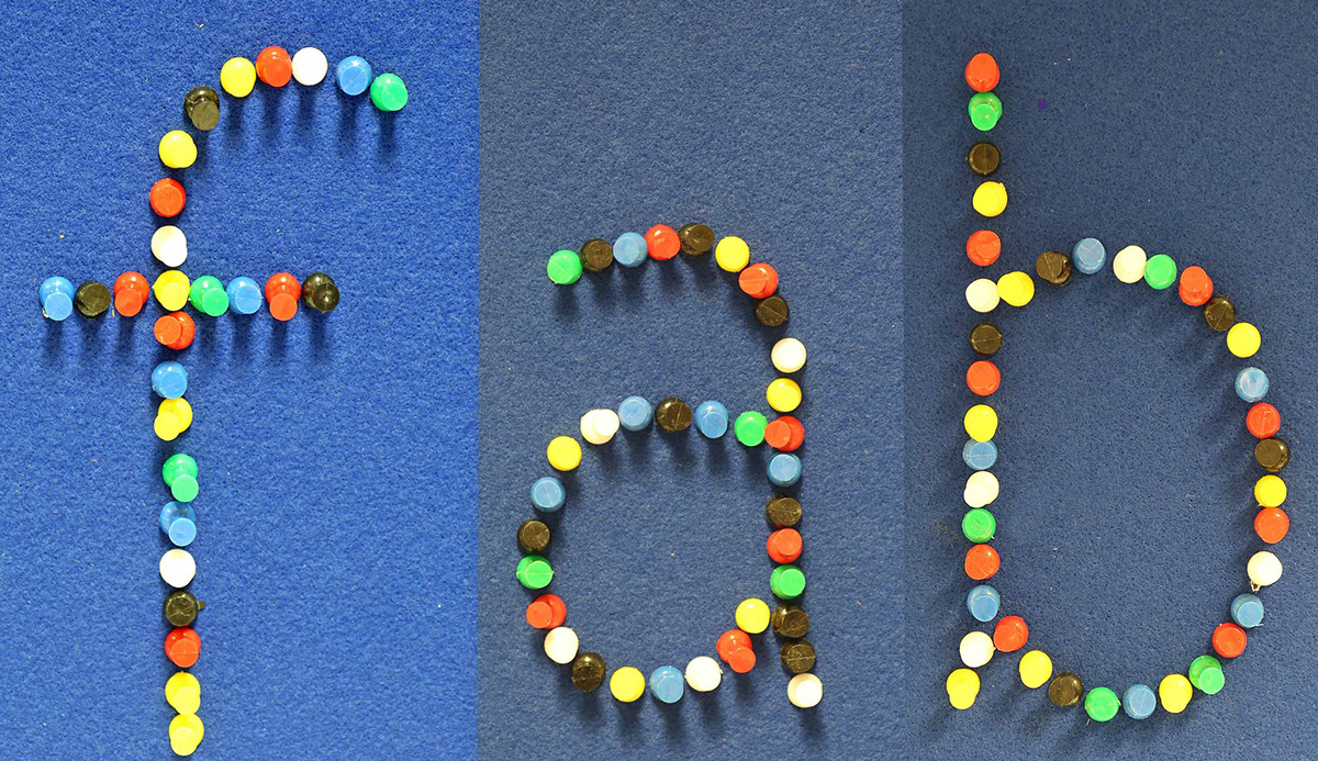
Pin Board.

Pin Board.

